A few nice folks around the web have been sharing visualisations of the most popular viewport sizes appearing in the analytics for their sites. I thought these were beautiful and useful and wanted to make it easier for people to create their own and highlight the need for responsive web design.

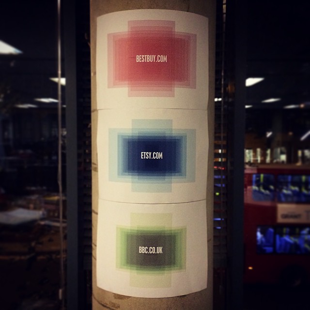
Lara Hogan of Etsy published the first which caught my eye. Etsy are doing great work when it comes to sharing their learning about site performance and optimisations. This was just another example of that.
Shortly after this image surfaced on Twitter, Sean Stopnik and Shaun Bent both created and shared their own visulisations from Bestbuy and BBC Sport. Lovely stuff. Thanks for sharing, fellas!
I decided to print these lovely images and display them on the wall in the R/GA London office. They serve as a nice reminder to all of us, developers and designers alike, that the web is squishy, and that we need to design and build for all manner of unknowns.
Make your own with Viewportify
It was quickly suggested that there must already be a tool on the web to generate these images rather than crafting them in Photoshop. To my surprise, I could find nothing that would do it for me... so I cobbled something together.
Enter Viewportify. A simple little tool which will turn a blob of analytics data about the viewports used to view your site, into an image you can share, save, print or whatever. It's clunky but it seems to work. I used it to create the graph on this page, which you can see in all its glory over here.
I'd love to see the gallery of visualisations or graphs grow as people generate and contribute their own.